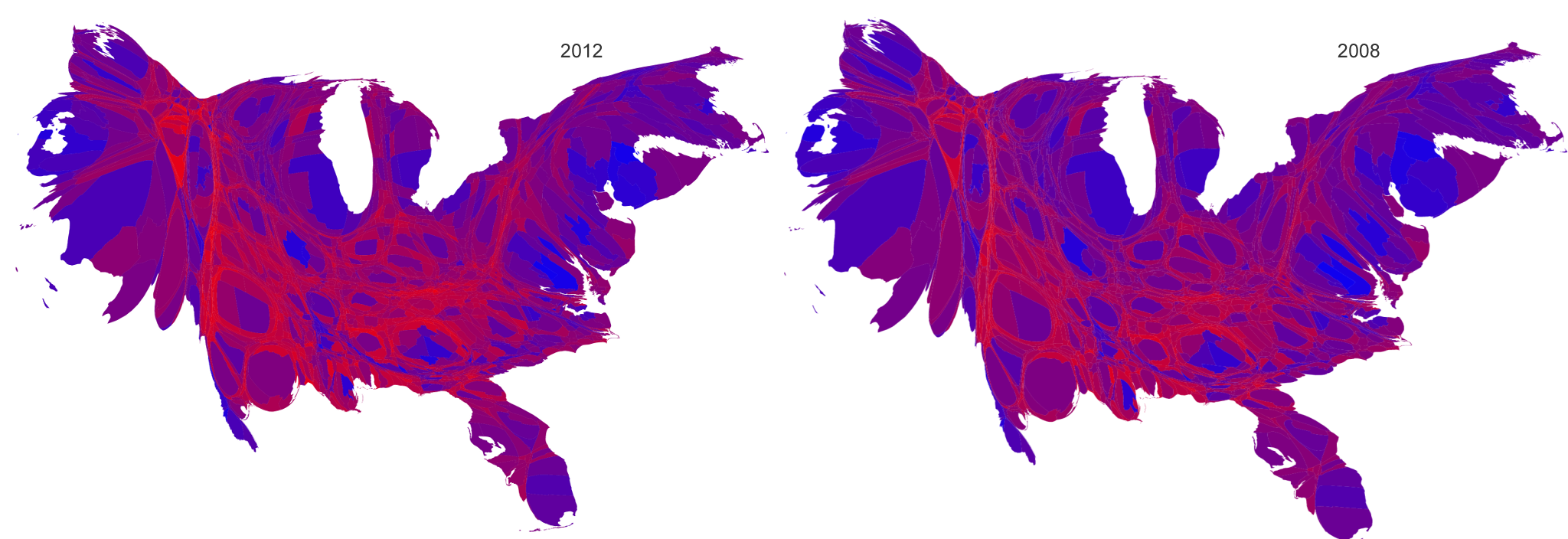
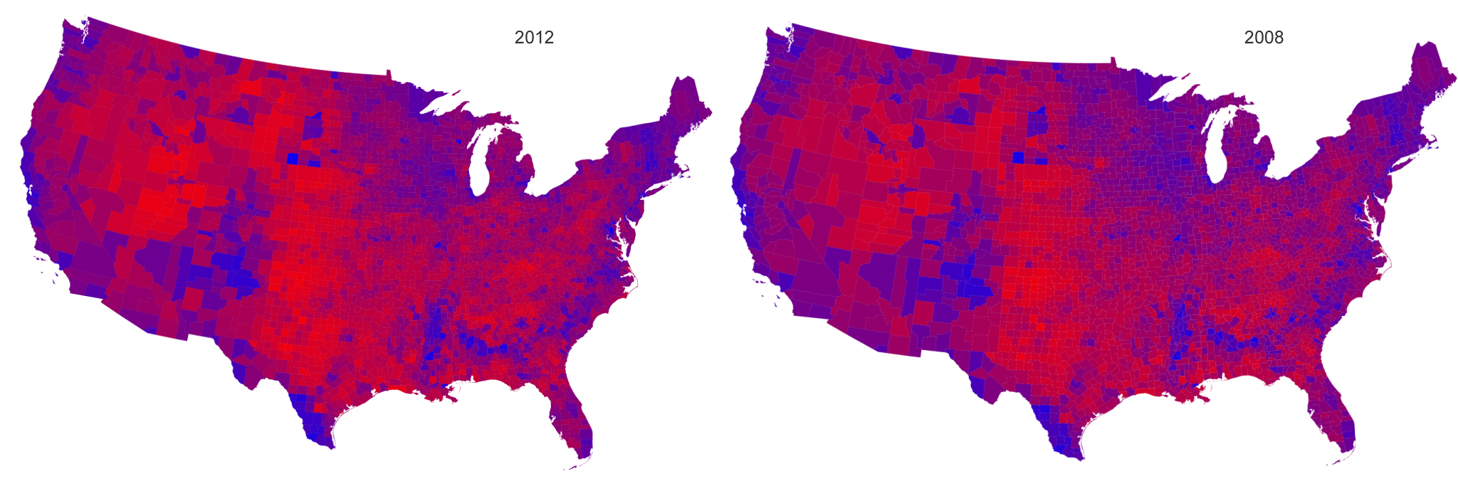
The 2012 elections are over, thankfully. Here's a comparison of how the country voted using more representative visualizations, and comparing the results to 2008.
These maps come from Mark Newman, Department of Physics and Center for the Study of Complex Systems, University of Michigan.
Purple Electoral Map (click to enlarge):
Purple Cartogram (click to enlarge):